RP3OPLE: Noah Mooney
A look inside the mind of our Head of Design
Head of Design Noah Mooney leads our talented team of graphic artists, finding creative solutions and elevating the visual identities of our clients and our agency with eye-catching and impactful design.
Since he joined RP3 in 2019, Noah's delivered outstanding work for clients including, Children's National, Koalafi, Hilton, EagleBank, Norfolk Southern, University of Maryland, Vision Council, Long & Foster, and more.
Noah embodies RP3's core belief in seeking the good, and we couldn't be more thrilled to count him among our team of passionate innovators. In his decade-long career and lifelong pursuit as an artist and social advocate, Noah has demonstrated a consistent and ongoing commitment to his craft and to helping those around him achieve their goals and influence positive change in the community.
I took an opportunity to chat with Noah and see the world through the eyes of a true visionary. In this edition of RP3OPLE, we get some words of artistic wisdom and discuss leadership, inspiration, and the future of design.
RP3OPLE TALK:
E: Hi Noah! Tell us how it all began — What got you into design? When did you first discover your passion for visual storytelling?
Noah: I've always been interested in creating things. When I was a kid, my friend and I started a comic book company out of my shed (Shedhaus Comics) and sold comics to the neighborhood kids for a quarter apiece. We wrote and illustrated them and produced black and white copies using the printer at the local library—this desire to create continued through high school, where I took an intro to design course.
E: Tell us about what you first started designing in your initiation into a formal study.
Noah: Oh, well, we designed books, posters, and logos in class, which I discovered I had a knack for. It allowed me to fuse the analytical side of my brain with the problem-solving, creative side. Ultimately, I decided to pursue design as a major in college, and every class, project, and internship I embarked on reinforced my love for design.
E: What about your first foray into the world of professional design?
Noah: I had the opportunity of working at Wolverine Worldwide as a summer intern on the Merrell shoe brand. That internship was the most practical work experience I had as a student — I worked on real projects, and my Art Director, Mike Gannon, was an excellent mentor and coach.
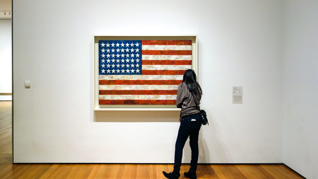
E: As an artist, we all have various sources of inspiration and motivation that constantly evolve and grow — who are some of the artists that have inspired you throughout your career?
Noah: Last February, my wife and I went to the Whitney Museum in New York, and they had a whole floor dedicated to Jasper Johns's work. You'd probably recognize his famous Bullseye or American Flag if you saw them. But, what stood out to me were all the iterations he did of each of his works. His depth and dedication to his craft continue to inspire me as a creator — also the work of Amy and Jennifer Hood, aka Hoodzpah. Amy and Jennifer are sisters who started a design agency in Los Angeles — they're doing incredible work. I heard them speak at Brand New Conference in 2019 and loved their presentation and overall style. They are outstanding entrepreneurs. They even wrote a book about design freelancing best practices which I would encourage anyone, artist or otherwise, to check out.
E: Fantastic! It's always important to think about the artists and work that has helped shape us. What are some recent trends you've seen in graphic design?
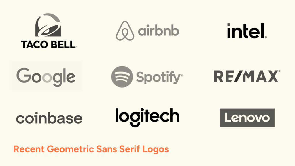
Noah: It was around five years ago, or a little earlier, when many large brands started shifting towards the modern, geometric sans serif look —think Google, Intel, Uber, Lenovo, Taco Bell, Re/Max, etc. I don't see that style going anywhere, but the market is becoming more saturated with logos and brand identities in that visual style.
E: It's always a constant struggle in this industry to find ways to differentiate yourself, and now more than ever, we live in a very visual world. What brand work excites you right now?
Noah: I'm excited about the recent trend of embracing styles and motifs from past decades. A lot of modern brands are drawing inspiration from designs from the 70s — warm colors, curvy serif type, and unique, hand-drawn illustrations: Brands like Mailchimp, Burger King, Reebok, and Chobani. Design and fashion have always been interlinked — as the fashion industry embraces styles from the 70s and 90s, it directly impacts the design world. On a more technical note, I've also seen a rise in proprietary typefaces explicitly created for brands. Many brands are now incorporating custom font creation into their design systems. Airbnb, Spotify, Visa, Tripadvisor, and Cadillac — these are all companies with bespoke fonts.
E: What would the benefit of a custom-made font be? That seems like such an unnecessary and potentially expensive undertaking.
Noah: Well, for starters, it's cool. It's the ultimate designer flex — aside from having your logo on the side of an airplane, of course. And actually, it cuts costs. Global brands pay thousands of dollars in licensing when they use typefaces across prominent print mediums and highly-trafficked websites. Custom, proprietary fonts may have a steep up-front cost, but in the long-term, you see huge savings.
E: I had no idea — I love that. So, it seems so obvious to ask a designer to talk about their favorite designers, but what about inspiration from unusual or unexpected sources? Do you have any out-of-the-box places that spark your creativity?
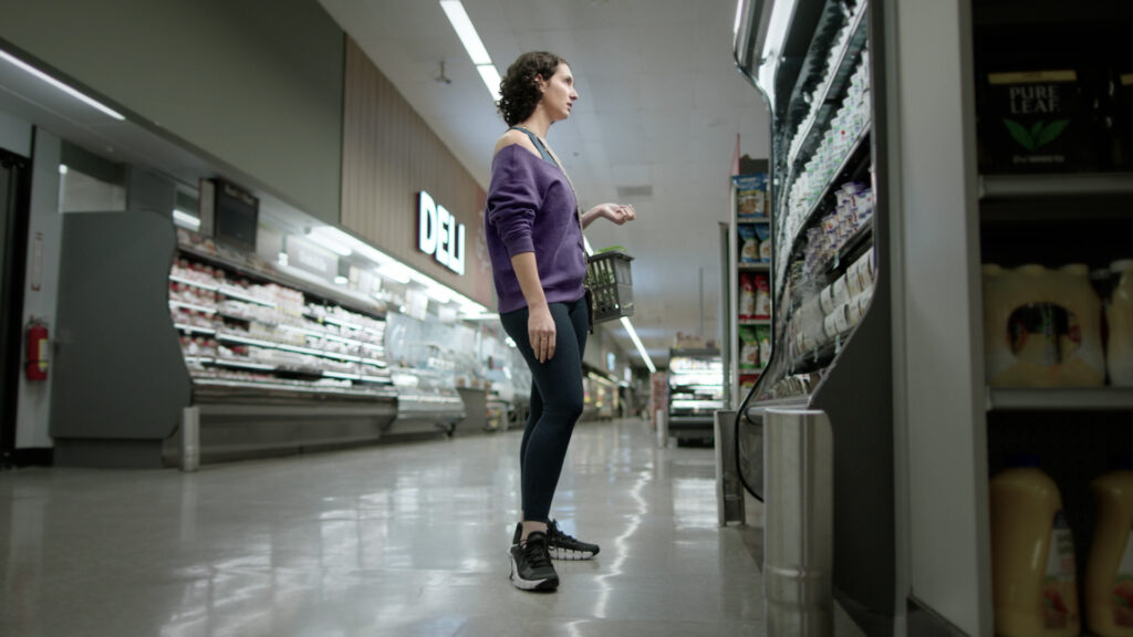
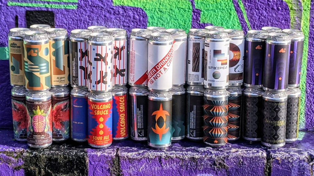
Noah: I love the grocery store. Yes, I love food, but what gets me excited is all of the packagings. So many brands, labels, and typefaces all in one place — it's overwhelming (in a good way). I love looking at the rows of different designs in the beer section — in many ways a beer can serves as a modern-day canvas for artists and designers if you think about it. A beer can, or any can for that matter, presents an opportunity to create something unique, memorable, and eye-catching. If you live near DC, you'll know about Aslin, a local brewery that started in Virginia. I love their label designs — simple yet bold graphic patterns make their product instantly recognizable.
E: Yeah, it all ties in to making a brand unique and stand out among a crowd. I love food also — perhaps too much. What an interesting point of view — grocery shopping may never be the same for me.
You've always been a leader, so this recent promotion (congratulations btw) was a natural and obvious move for you and the agency. How do you encourage and guide your team to succeed and develop together and as individuals?
Noah: I like to make sure that my team and I check in frequently throughout the week and keep channels of communication open — constant communication helps us solve challenges we come across on our projects. We have a weekly team meeting, where we have time to share what we've been working on or something that inspires us.
As peers, we share inspiration and gain insight into each other's work. It's all about collaboration and providing one another with honest, constructive feedback to deliver the best results. You cannot work in a vacuum — we all add valuable perspectives. We also share learnings, tips, or tricks we've discovered that week. Any technique or tool that will improve our productivity or creative output is always welcome and valued.
Another thing I find extremely important is goal setting. I work with my team to set strategic goals for themselves and our group. It may sound like a lot of HR jargon, but I find goal setting highly beneficial. Having a clear objective to work toward helps us maintain our course, and frequent check-ins keep us accountable for those goals.
Making time to connect and share ideas is such an essential part of team building. In fact, we're about to have a team retreat in October — it'll be a time for us all to get together in person and workshop ways for our team to work more cohesively together.
E: I couldn't agree more, and it sounds like you've built something truly special with your team. As a parting question, I have to ask — what advice would you give to a new graphic artist who wants to make a career in graphic design?
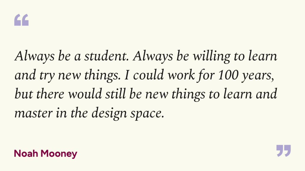
Noah: I'm sure there's a lot I could list here, but one piece of advice stands out — Always be a student. Always be willing to learn and try new things. Design changes and evolves constantly. New trends, techniques, and ideas are constantly surfacing all around us. You'll go a long way if you have a student's attitude. I could work for 100 years, but there would still be new things to learn and master in the design space. I always aim to have a few irons in the fire. Right now, I'm trying to learn more about 3D design and animation.
E: Well said, and wow! Please keep us posted on that. Thank you so much for taking time out of making the world more beautiful, in every sense of the word, to chat with me. I've learned a lot, and I feel lucky to be counted here among you and your exceptional team.
News
Let's make some good.
Drop us a line